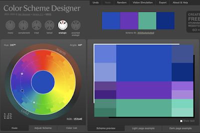
 You can dial the scheme around the wheel by placing your cursor onto the floating dark dot. In this way you can see how color relationships change. Here’s a set of cool analogous colors.
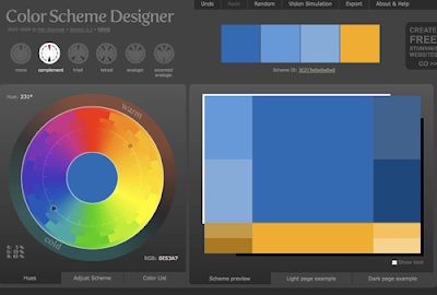
 The color swatches on the right are from a complementary scheme playing blues against orange-yellows. The swatches that come out are automatically produced in a variety of values.
 For the designer or decorator, this tool is an interesting way to stimulate new ideas and try things on for size.
Color Scheme Designer
Thanks, Gene


6 comments:
yes that is a great tool.. can i suggest a couple of others? here they are:
http://www.colorschemer.com/online.html
http://kuler.adobe.com
thanks for all the sharing info in your website.. guido
Hi, if you are interested here's a Rembrandt's complete online catalogue whit high resolution paintings!
http://staff.science.uva.nl/~fjseins/RembrandtCatalogue/index.html
have a good day!
your blog is really great! :)
I'm a graphic artist at a public library, responsible for making handfuls of posters every week to advertise different events, ranging from kids stuff (Celebrate Dr. Seuss' Birthday) to seminars for elderly (Ebay made Easy!)
I use Color Scheme Designer all the time, and only once or twice did I go with a scheme that ended up being an eyesore. Its otherwise brilliant with proper evaluation. Using the Light Box/Dark Box options at the bottom right are extremely useful.
The Colorscheme Designer is what I use as well when teaching webdesign classes.
The only problem is that you always end up with color-theory-compliant color scheme.
It can also be interesting to run the Colorscheme Designer, and then change one of the resulting colors for a more 'edgy' color scheme. Your work will be noticed much more easily with a deviating color scheme.
I always say to my students (litteral translation from Dutch to English): if it hurts your eyes, but does not cause pain, you can use it.
Another way to achieve a pleaseant color scheme without using triads, complementary colors, etc, is just looking for a photo that has a pleasant colorscheme. The colorschemes that you find that way, aren't corresponding to color theory in most cases but allow you to find a nice colorscheme without entering the paths that many took before you.
Michael, yes, this system can work for painters, too, especially as a starting point. But as Ivo points out, it IS a mechanical or system-based approach, and sometimes the surprising notes of color that come from outside the gamut give a color scheme the fresh twist that makes it work.
Marco Nelor posted a link to a very interesting online tool today, which uses flickr images. You can select some colors from a box and the tool then shows a series of flickr images that have these colors. Try it, it's amazing!
The tool: http://labs.ideeinc.com/multicolr
Marco Nelor's blog:
http://thurd-eye.blogspot.com/2010/05/multicolr-search-lab-idee-inc.html
Post a Comment