


Here are the results of the Watercolor Pigment Poll, which closed yesterday. The poll asked you to: "Vote for your 8 Absolutely Indispensable Watercolor Pigments." Thanks for voting. There were 147 votes in all.
Most Indispensable Watercolor Pigments
 |
Antique English inlaid mahogany watercolour box
made by Winsor & Newton around 1850.
|
1. Ultramarine Blue—109 votes (74%)
2. Burnt Sienna—76 (51%)
3. Alizarin Crimson—72 (48%)
4. Cadmium Red—68 (46%)
5. Cadmium Yellow—66 (44%)
6. Burnt Umber—58 (39%)
7. Yellow Ochre—57 (38%)
8. Lemon Yellow—48 (32%)
9. Cobalt Blue—45 (30%)
10. Paynes Grey—44 (29%)
11. Cerulean Blue—43 (29%)
12. Raw Sienna—35 (23%)
13. Opaque White—34 (23% (tie))
14. Sap Green—34 (23%)
15. Gamboge—30 (20%)
16. Phthalo Blue—28 (19%)
17. Quinac. Rose—26 (17%)
18. Prussian Blue—23 (15%)
19. Viridian—22 (14%)
20. Raw Umber—20 (13%)
21. Hansa Yellow—17 (11%)
22. Perm. Magenta—17 (11%) (tie)
23. Hooker's Green—16 (10%)
24. Sepia—16 (10%)
25. Bone or Ivory Black—16 (10%)
26. Phthalo Green—11 (7%)
27. Other (in comments)—10 (6%)
 |
| Winsor and Newton color chart from 1910 |
Fewer than 10 votes
Pyrrole Red
Vermilion Red
Carmine Red
Venetian Red
Scarlet Lake
Cobalt Violet
Perm. Violet
Neutral Tint
Indian Red
Terre Verte
Emerald Green
Perm. Green
Manganese Blue
Lampblack
Conclusions
1. No greens made the top ten. Nor did black or white. Perhaps that's as it should be because it's quite easy to mix greens and blacks, and doing so offers the benefit of attractive variegation in the mixtures. And the question of whether, when, and how to use white—well, that's a whole 'nuther topic.
2. Ultramarine was #1 by a wide margin, and for good reason. It's an extraordinary pigment, nowadays synthesized cheaply by modern chemistry. But centuries ago when they had to mine it in Afghanistan as lapis lazuli, it was more valuable than gold. More about ultra's history here.
3. You could make a good palette out of the top 12. It would include a warm and cool red, a warm and cool yellow, three fine blues, and some good earth colors. You could even get by with a palette made of the top five.
4. Alizarin Crimson was #3, but before you buy it, remember that true Alizarin (PR 83) is prone to fading. Read more at this previous GJ post. But if you're painting in sketchbooks, you don't have to worry as much about lightfastness.
5. You can make a great color scheme out of almost any three pigments chosen at random. The limitation encourages harmony. Check out Nathan Fowkes' recent blog post, where he harmonizes lemon yellow, Venetian red, and ultra.
5. You can make a great color scheme out of almost any three pigments chosen at random. The limitation encourages harmony. Check out Nathan Fowkes' recent blog post, where he harmonizes lemon yellow, Venetian red, and ultra.
 |
| North America? Courtesy Golden Art Supplies |
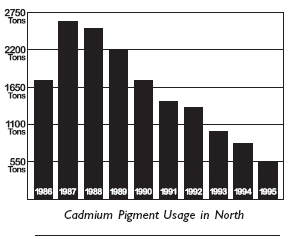
A Note about Cadmiums
Cadmium red and cadmium yellow both appeared in the top ten. The cadmium pigments have been the subject of some controversy, because of the toxicity of the pigments, the regulatory requirements governing the manufacture, and concerns over environmental impacts after disposal.
Usage has been dropping, and there have been proposed cadmium bans. Those bans have been successfully opposed in most regions, largely due to exemptions of art supplies from banned products lists, but that may change eventually.
There are worthy modern alternatives, such as pyrrole red and hansa yellow, but they're not as well known.
Previous Poll
I conducted a similar pigment poll back in 2008, without specifying the medium. Back then, most people probably assumed I meant oil paint. The top ten in that poll did include black and white, which are more commonly used by oil painters, but otherwise the results were fairly similar.
Results of the 2008 Poll (which didn't specify the kind of paint)
1. Ultramarine Blue 1802. Titanium White 172
3. Yellow Ochre 161
4. Cadmium Red 158
5. Cadmium Yellow 150
6. Burnt Sienna 150
7. Alizarin Crimson 141
8. Burnt Umber 126
9. Black 98
10. Raw Umber 97
11. Raw Sienna 81
12. Cerulean Blue 79
13. Cobalt Blue 73
14. Viridian 64
15. Naples Yellow 60
16. Sap Green 56
12. Cerulean Blue 79
13. Cobalt Blue 73
14. Viridian 64
15. Naples Yellow 60
16. Sap Green 56
------
15 comments:
Hey James,
Great Poll, I agree with you about the Cadmiums, Ive been looking for alternatives myself. I really like the Hansa Yellow Light, and Pyrrole Red, but I cant seem to find a good alternative to Cadmium Orange.
In the recent list I sent you I made a mistake and included White Gouache as one of my indispensable colors, I meant to include Yellow Ochre or Raw Sienna, I like both pigments, and I like to have at least one of them.
My 8 would be Hansa Yellow Light, Yellow Ochre Pale, Pyrrole Red, Permanent Rose, Burnt Sienna, Ultramarine Blue, Cerulean Blue, and Viridian.
Do you know of any nice orange pigments that can replace Cad. Orange?
I don't totally agree about Hansa yellow as a replacement of cadmium yellow... In fact, I know both pigments quite well. Ok - not quite well in watercolor. But as far oil painting is concerned, there is a huge difference in opacity. The color is about the same. What makes the cadmiums so unique still isn't the color but their remarkable opacity...
Krystal, you're right--of all the cadmiums, cad yellow light is the hardest to replace, especially if you need the opacity. Hansa is usually fairly transparent, which is fine in watercolor. I haven't tried the "opaque" version of Hansa that Golden was talking about on their link, but they mention that some of the organic replacements have other advantages, not the least of which is price.
I've almost entirely switched to pyrrole red in oil because I think it mixes better toward violet than cad red. So if I had to pick one bright red to take out with me, I might almost prefer the pyrrole--plus I love that they use it on race cars.
Jason, I know you've done lots of polling and experimenting about different palettes. I really like your 8 color shortlist. I'm not sure about cad orange replacements. I don't usually need cad orange, but I might if I was pushing the gamut with painting flowers or neon or something.
For people who want to get really deep into pigments, check out Bruce MacEvoy's site HandPrint: http://www.handprint.com/HP/WCL/watero.html
Regarding substitutes for Cad Yellow Light, Nickel Titanate Yellow with some Gamboge mixed in provides an interesting opaqueish alternative although not an exact match. It's not an easy color to find although Da Vinci makes it. One thing to love about Nickel Titanate Yellow is its granulation and the wonderful effects and interesting separation that occurs when it's mixed with another color, especially (for example) Cobalt Turquoise!
FINE, I admit it...watercolor pigment addict here.
Great poll and it would be fun to take the top 3, 5 or 10 and just go with it!
I bought your WC video and have been avidly following all of the posts this week - a couple of things I am still grappling with for my kit and I hope you can answer:
1)How do you protect your brushes from damage with all the jostling they get in a to go pack? If they are loose in a container the tips can get damaged and that seems a pity particularly for expensive sable brushes. I am also having a problem finding something big enough for short handle brushes that isn't so long that it is hard to pack - any suggestions?
2) If you are holding your sketchbook on your lap (vs using the stiff board behind) how do you manage that with the landscape format? It is pretty floppy and somewhat of a balancing act. The only thing I could think of was to put a binder clip across the gutter/hinge area to help stabilize it.
All suggestions welcome!!
I just read Marque's question number 2 and thought about how I always slouch when I sketch with the sketchbook on my lap. Couple that with a sedentary office day job, and you have some serious back pain waiting to happen. At least that is the situation I am in right now. I know I should do regular exercise (I have just started running and skipping again) and I was wondering if you were ever kept from painting by back pain? I imagine unicycling helps strengthening the core and thus supporting the back?
Marque, great questions. I'll start off the post tomorrow with my own answers.
Monbaum, my posture ain't so hot. Most of the time I look like a question mark when I'm sitting to sketch. Jeanette's got me joining in to her morning Yoga exercises.
James :-) *grin* that's a comfort to hear... in a way. Glad Jeanette is trying to keep you straight.
I must tell my other half Rolf to be more strict with me - after all he has a fitness instructor certificate.
I must try that yoga thing as well.
all the best
Monika
Thanks for all the great info that was put into the video! Also, I'm glad to hear you discuss the cadmium issue, it's something I've been really looking into since I'm putting together a new palette.
Thank you for a fun poll and interesting commentary! I wouldn't bother with a premixed green, it is nicer to mix your own.
I do find Cad Orange very useful for getting the coat color right in some of the wildlife I paint, so would also be interested in knowing about alternatives.
I'll get a tube of pyrrole red and try it. I currently use Rembrandt Permanent Medium Red as a result of taking Scott Christensen's Ten Day Plein Air intensive back when he only used a four color palette (Ult. blue, the Remb. red, Cad. yellow med, titanium white), plus two greys. It has good opacity and plays well with my other colors, which are mostly Winsor Newton. I still go back to that palette sometimes for small quick studies.
Hi James,
Just watched your video through (DVD arrived today). Great resource. I know I'll be watching it again (and again).
My favorite segment was the church yard, second favorite "Rosebud," because I think in both there is more of a complete sense of how the sketch develops, without gaps.
Regarding pigments: When I first tried watercolors as a complete neophyte, I bought a bunch of Winsor and Newton artist's tube colors (about 20), squeezed them out into the "cups" around the edge of a huge flat porcelain palette, and allowed them to dry. I had no idea what I was doing, but just dove in. A few of them had interesting properties that I didn't understand very well, but this made for some successful accidents. There were probably too many colors for a beginner, but it was a good way to get introduced to a lot of different pigments. (I still have that palette, and it's great if you have a lot of free tabletop space. Lots of room to mix colors; lots of pigments; not at all portable.)
I just recently picked up the 12-pan starter set from Schmincke, and it looks like it has a decent selection of colors to get started. Kind of expensive, but looks like good quality materials, and they ought to last, especially with small sketches. And though it's not tiny, it's definitely portable.
Thanks again for all the great info on this blog.
Dan
Did anyone see the film Gasland by Josh Fox ? As a result of hydraulic fracturing for natural gas the outslip (amongst other dangerous elements) cadmium was mentioned. I wonder who is poluting the best artists or the gas industry ?
Dan, thanks for the feedback, and I'm glad you liked it. Great story about the big porcelain try. Just diving in is the way to learn--throwing caution to the wind.
I love that little Schmincke set, too. I've juggled some colors in and out, but still use it regularly. It's compact, but feels like a bigger box.
Garrett and Jytte, haven't seen that documentary, but I wonder if you're right. I read somewhere that the major environmental polluter with cadmium is the battery industry (nickel cadmium batteries).
Sfox, thanks for the tips on cad orange replacements. Scott does wonderful things with color.
Martha, I agree, though I'll admit that even though I've been guilty of pooh-poohing phthalo green, I had it with me one time and I absolutely needed it for a certain mixture, so I respect the stuff. And I do love viridian, especially in oil, for a complement in skin tone mixtures.
Monbaum, my yoga "plank" attempts are pretty pathetic, but I'm trying.
Thank you for your comment, James! I opened my Windsor Newton box after the poll results and saw I had a sap green in there and that I had used it! LOL Joke's on me.
Post a Comment